Home-field Advantage
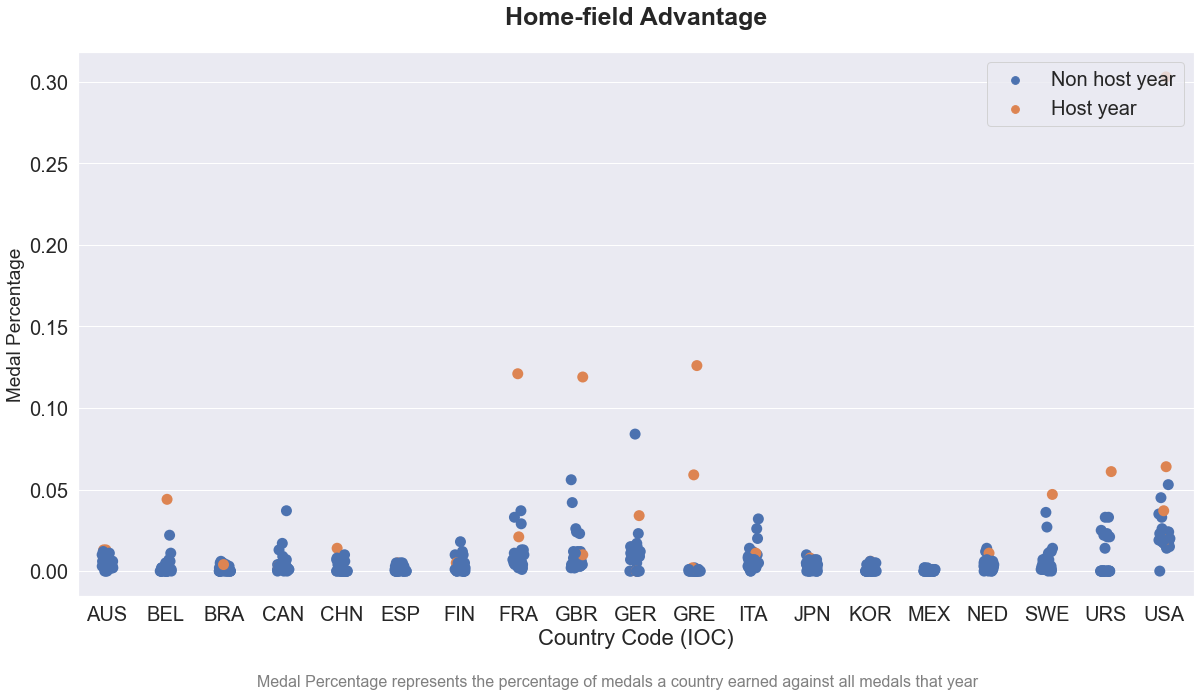
As discussed above, we first tried scatter plot with jitter. The x-axis is the countries that have ever hosted the Olympics and the y-axis denotes the percentage of medals earned by a country against the total number of medals in that year. Blue dots represent data when the country was not the host and the orange ones for when it was the host. See Figure 30.
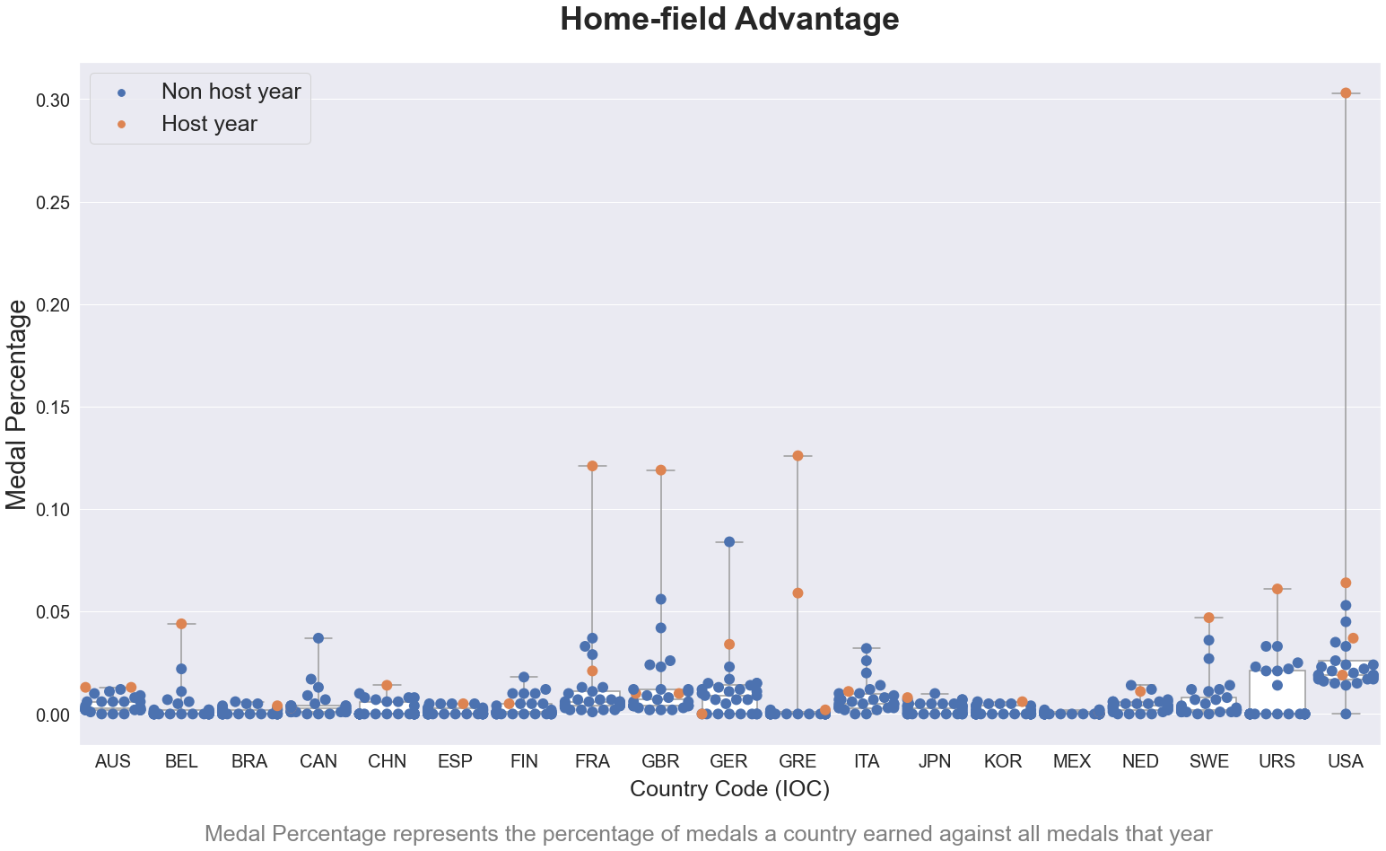
The blue dots were too packed. We later tried beeswarm plot coupled with box plot. Dots were shown much more clearly but one drawback is that we could not see the density distribution of all the dots very well. Density distribution was important in this case because it would allow an easier comparison between the medal percentage when a country was a host and that when it was not. See Figure 31.
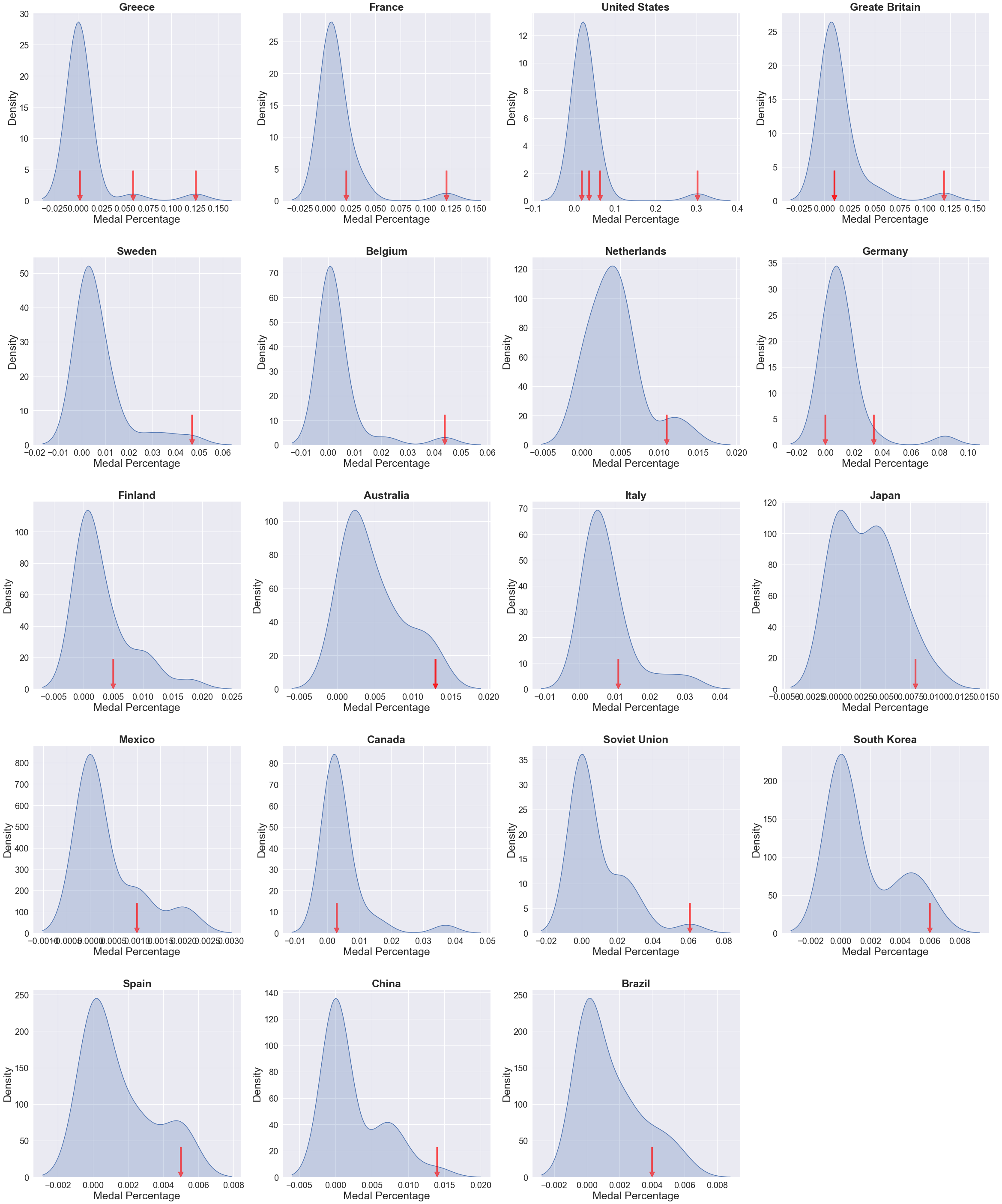
To show density distribution of medal percentages, we used kernel density estimation in a small multiple. The x-axis is the medal percentage and the y-axis is the probability density. We used a red arrow to denote when the country was an Olympics host. An arrow located at the tail would indicate the existence of home-field advantage. See Figure 32.