Female Participation Across Continents
To visualize changes in female participation in each continent, we first used a simple line graph where we put all the continent together. The x-axis is time, and the y-axis is female participation. The legend shows the colors associated with the continents. See Figure 25.
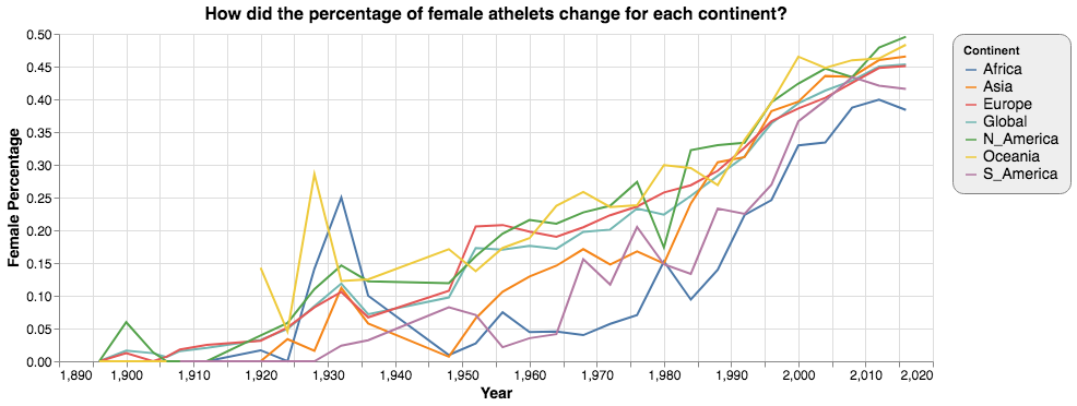
The graph was very messy. As there were six continents and one global average, we could not distinguish between the seven categories very easily. So we gave up this option.
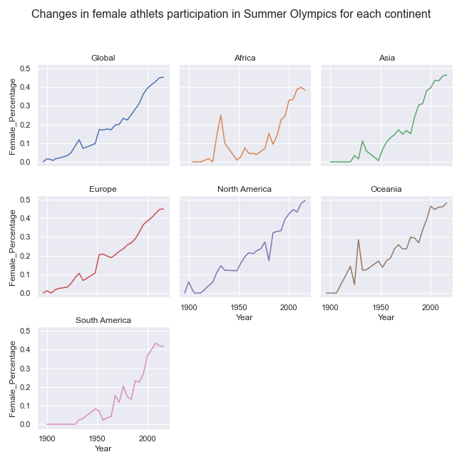
Then we tried a small multiple in which each continent and the global average were shown in simple line graphs. This chart showed every continent clearly but it was not very easy to make a comparison. See Figure 26.
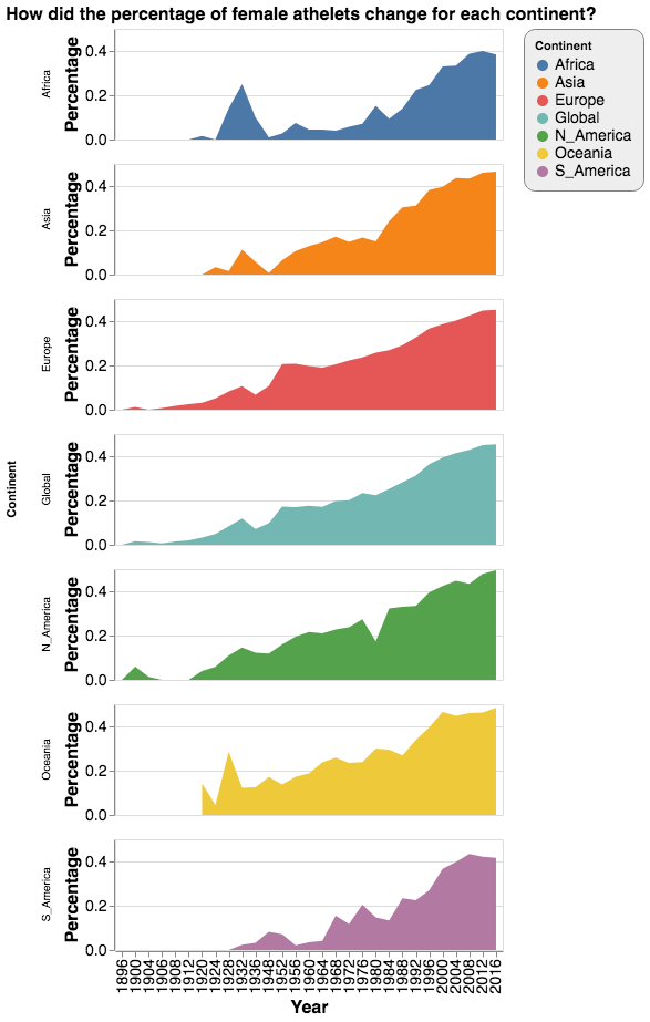
To make comparisons clearer, we decided to use an area chart. We stacked each area chart each representing a continent along a vertical line. However, comparisons were still difficult. Most importantly, in terms of using color as the visual encoding, this graph has too many categories. Besides, it has red and green at the same time, and therefore is not accessible to colorblind populations. See Figure 27.
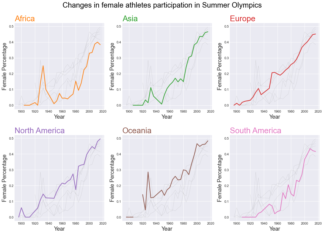
We then went back to the small multiple. Since we cared about the comparison between each continent, we decided to plot every continent and the global average in each of the six graphs. We highlighted only one continent in each graph, and set all other continents grey in the background. It worked much better than out earlier attempts, but one drawback is that it did not allow comparison with the global average. See Figure 28.
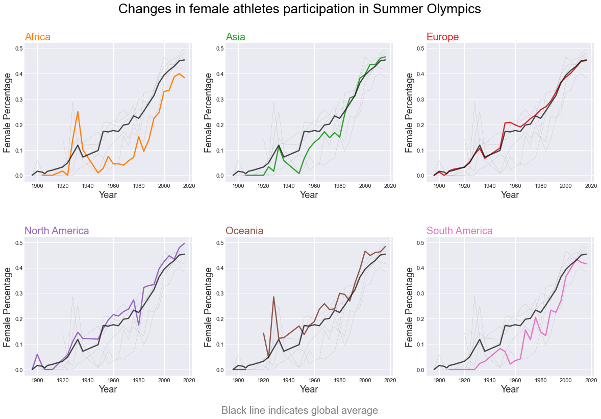
Finally, we decided to highlight the global average with a black line. This time, comparisons both between continents and with the global average were clear. See Figure 29.