Plans: Home-field Advantage
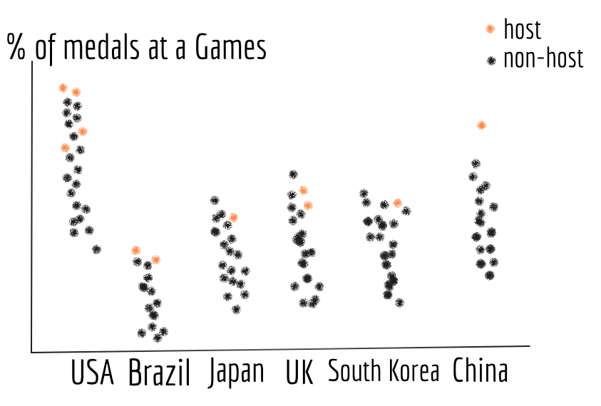
To examine whether there exists a home-field advantage at the Olympics, we will first use a scatter plot with jitter. The x-axis will be countries that have ever been a host, and the y-axis will be the percentage against the total number of medals a country earned. Each dot represents an Olympic Games the country has participated in. Black dots denote data for a “non-host” year and orange dots denote data for host year. See Figure 16.
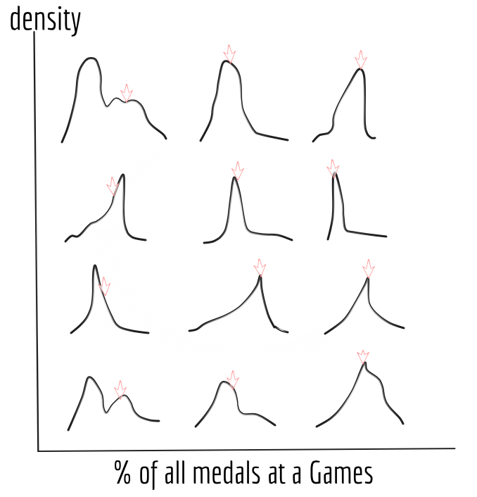
To better show the density distribution of medal gains, we will employ kernel density estimation in a small multiple. The x-axis will be the percentage against the total number of medals at a Games and the y-axis will be density. We will use an arrow to denote the density of a year when the country was a host. See Figure 17.
Arrows located at points with high densities, would be signs of the existence of home-field advantage at the Olympics.