Plans: Female Participation
As discussed above, we will use a line graph, stacked bar chart, and area chart to show the overall trend of female participation in the Summer Olympics. For female participation in each individual continent, we will use KDE in a small multiple.
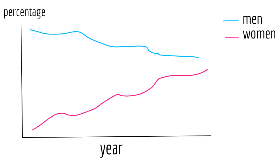
In a line graph, the x-axis will be time and the y-axis the percentage against the total number of participants. We will show both female and male athletes. See Figure 12.
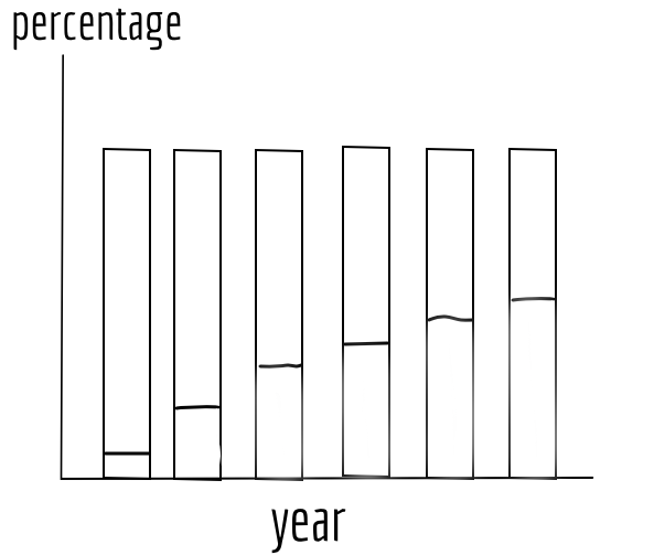
For stacked bar charts, the x-axis will be time and y-axis percentage against the total number of athletes. Two segments in each bar will represent male and female respectively, and the two will sum up to 100% for every year presented. This will make the comparison between male and female participation very clear. See Figure 13.
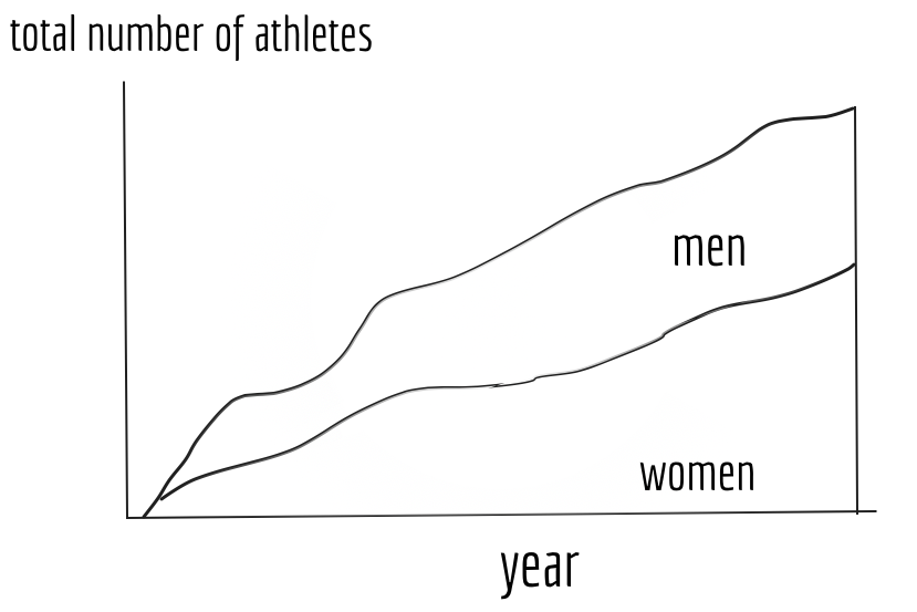
In order to also show the changes in the total number of athletes, beside the changes in percentages, we will use a stacked area chart. The x-axis will be again time, and the y-axis will be the total number of athletes for each Olympic Games. See Figure 14.
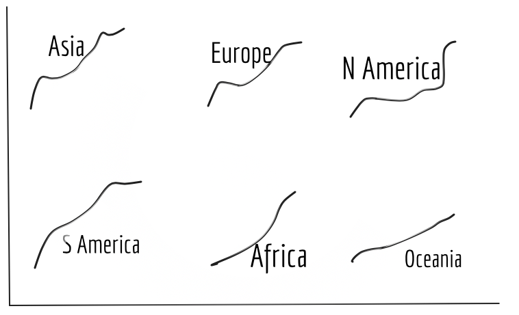
For female participation in each individual continent over the years, we will line graphs in a small multiple. The x-axis will be time and the y-axis will be the percentage of female athletes against the total number of athletes. To make comparisons between continents and with the global average clearer, for each plot in the small multiple, we will put the line graph of other continents in the background, and we will also plot the global average as the benchmark. See Figure 15.