
Female Participation in Summer Olympics
Many attempts have already been made to visualize female participation in the Olympics. The most basic one (Bmallion, 2015) is using tables to display the information about countries with the highest and lowest percentages of female athletes, and to show female percentages across the 120 years of the Olympics. See Table 1.
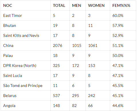
This method is simple and informative. This is useful for researchers looking for information on this topic, but it is not effective in terms of visualization. For example, looking at the plain number won’t help viewers have a clear idea of the trend in female participation in the past 120 years.
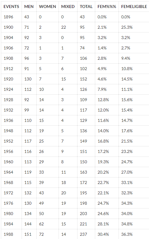
Another simple but effective method is using a line graph displaying the number of female and male athletes in each Olympic Games from 1896 to 2016 (Nunes, 2019). See Figure 1.
This graph is successful in showing the growth in the number of female athletes. However, it fails to show the percentage change. Although viewers can see directly the increase in the total number, they might find it difficult to notice the changes in the percentage.
Washington Street Journal did an interactive visualization comparing the inclusion of female and male events in the Olympics history (Serkez, 2018). It clearly shows that most men’s events were already established before the 1960s, whereas most women’s events were only introduced after the 1980s. See Figure 2.
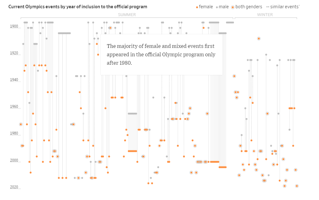
Each individual dot represents a sport of a gender. When clicked, there will be a line connecting to the same sport of a different gender, and information on the inclusion of this sport for both genders will appear. Overall, this visualization clearly shows how late the introduction of female events was in the Olympics history, but it did not show how the number and percentage of female athletes changed over the years.
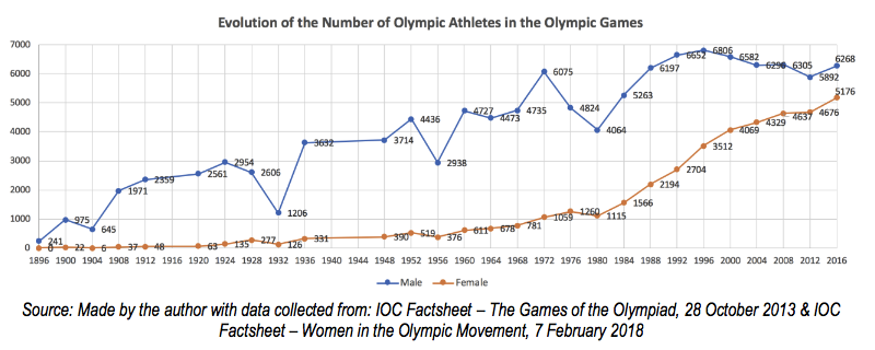
The official website of the International Olympic Committee (IOC) also made an attempt to show the growth in the percentage of sportswomen in the Olympics. See Figure 3.
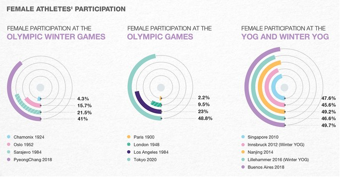
As can be seen, it is effective in the way that it shows the dramatic changes in female participation by showing four Olympics in each of the charts. However, its drawback is obvious: the number of Olympic Games that are able to be displayed is extremely limited. It is impossible to show the information of all the Olympics in the past 120 years using this method.
Although there were many attempts visualizing the evolution of female participation in general, few visualizations exist showing the percentage change by continent. The only piece we found is several tables showing men and women participation in the Olympics from 1996 to 2016. No visualizations on this information were made. We decided that there is a gap here. Although both the total number and relative percentage of female athletes have been growing (Nunes, 2019), the increase might be different between continents. We decided to take a closer look at this in our study.